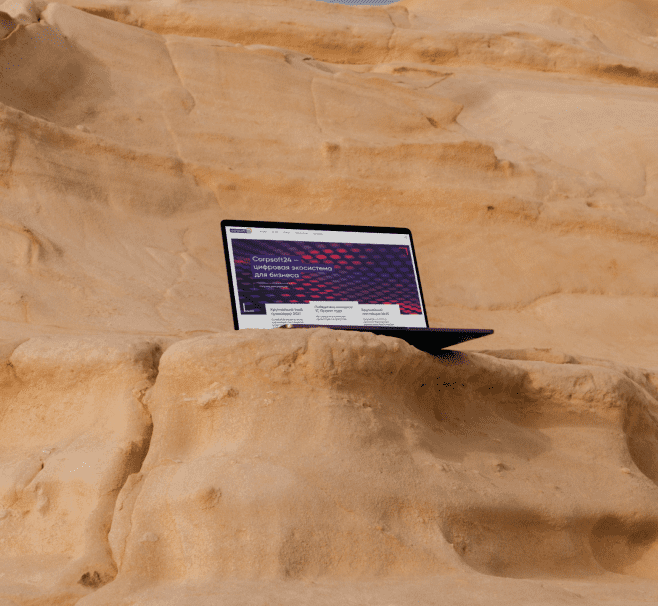
CorpSoft24
Redesign of Corpsoft24 multipage website. Corpsoft24 is a digital ecosystem for business. They offer implementation and support of software products for business automation and also their software products for business tasks.
The largest IaaS provider 2021 in Russia
Early 2022
Portfolio // Portfolio // Portfolio // Portfolio // Portfolio // Portfolio // Portfolio // Portfolio // Portfolio // Portfolio // Portfolio // Portfolio // Portfolio // Portfolio // Portfolio // Portfolio // Portfolio //Portfolio // Portfolio // Portfolio // Portfolio // Portfolio // Portfolio // Portfolio // Portfolio // Portfolio // Portfolio // Portfolio // Portfolio // Portfolio // Portfolio //
My role
UI/UX Designer
Timeline
6 months from concept to launch
Collaboration
2 Product Managers
1 Project Manager
1 Copywriter
1 Art Director
2 Web Developers
1 Project Manager
1 Copywriter
1 Art Director
2 Web Developers
Toolbox
Figma
Adobe Photoshop
Notion
Responsive Design
Adobe Photoshop
Notion
Responsive Design
(...) Problem
Corpsoft24 has many complex IT products. The task of the site is not to confuse the user and to tell about each service as clearly as possible. Also, the new design should be modern yet solid.
The inner pages of the products have the structure of a landing page. Unfortunately, most of those pages were outdated and consisted of blocks identical in purpose but different in implementation. It took a great deal of time to build another page and they weren't consistent with the rest.
The inner pages of the products have the structure of a landing page. Unfortunately, most of those pages were outdated and consisted of blocks identical in purpose but different in implementation. It took a great deal of time to build another page and they weren't consistent with the rest.
(!!!) Solution
Established an expandable design system in Figma, which includes colors, typography, iconography, grid, spacing, using auto layouts and atomic design. It helped speed up the process of creating new pages. Also the brand is consistently represented along every step of the user journey
Process
(5) Improve
• Improving the design according to feedback
(1) Brainstorm
• Project goal
• Target audience
• Pain Points
• User’s challenges
• Generating ideas
• Target audience
• Pain Points
• User’s challenges
• Generating ideas
(2) Define and Ideate
• Who the product is for
• What the product will do
• Problem statement
• User Flow
• What the product will do
• Problem statement
• User Flow
(3) Prototype
• Lo-Fi Wireframes
• Hi-Fi Wireframes
• Design System
• Hi-Fi Wireframes
• Design System
(4) Test and Launch
• Stakeholders’ feedback
• Sharing first version with the public
• Users feedback
• Sharing first version with the public
• Users feedback
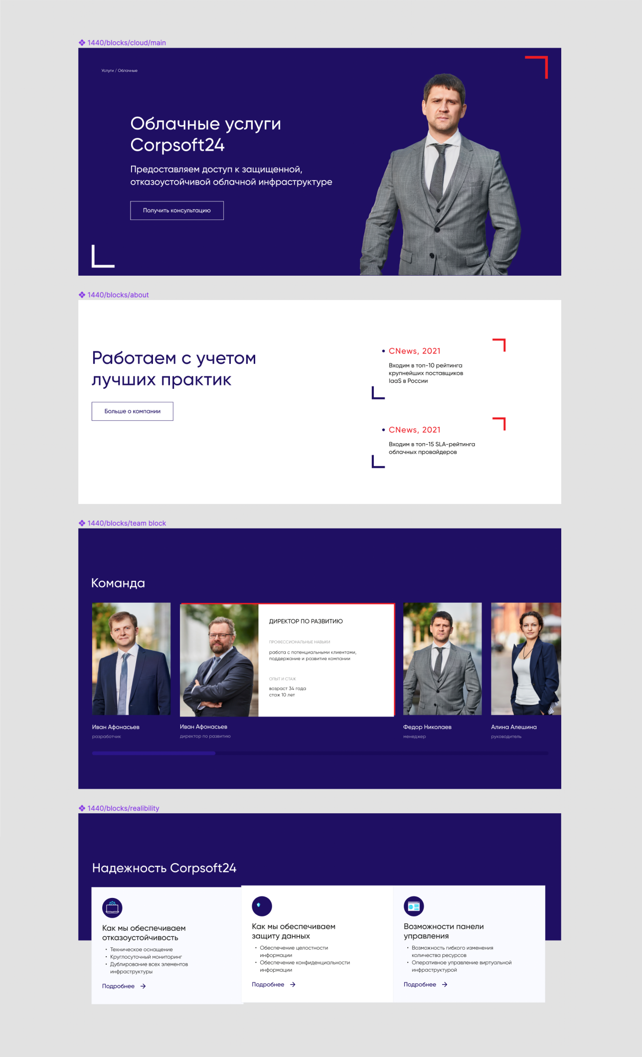
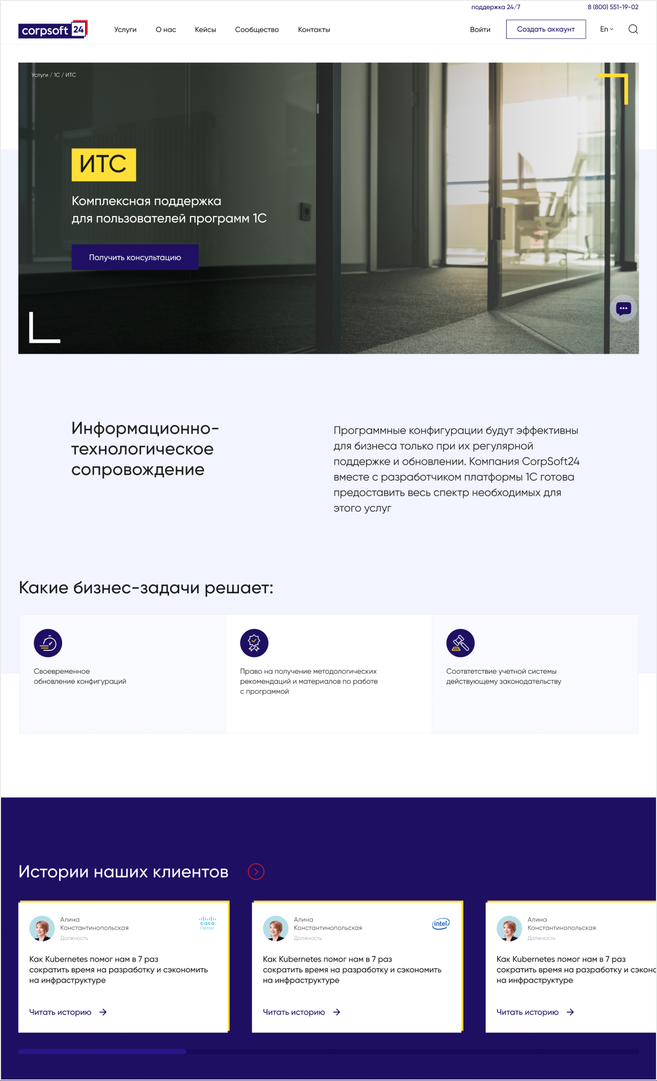
Structure
We divided all the content into several sections (highlighted by color) to give the design to developers in parts and work in parallel with them. It speeded up the launch of the site by several months

Variant #1
Variant #2
Variant #3

Variant #4
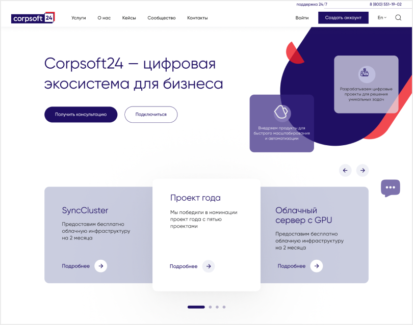
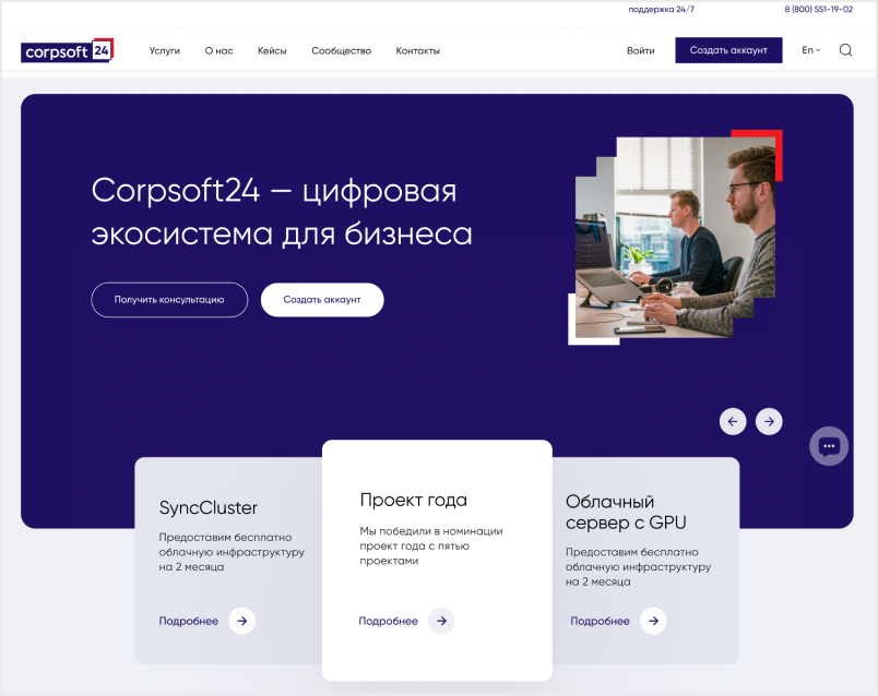
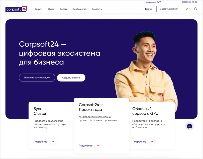
Design concept within branding
There were four options at the stage of selecting the design concept. The first option turned out to be too friendly for this company. We came up with a balance between friendliness and solidity in the last iteration of the design
Made the popup with long text look better
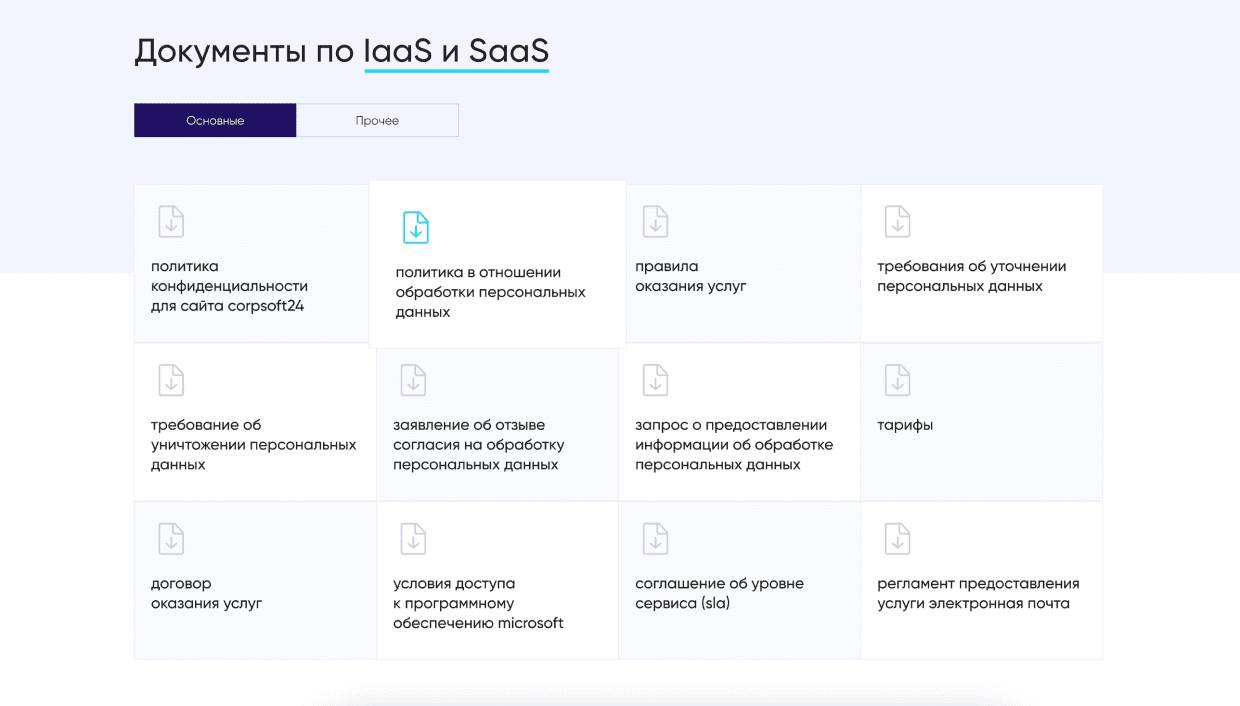
The product description had a lot of cards with long text in a pop-up. I redesigned them in a "stories" format, which helped improve the readability of the text.

Pop-up in the prototype
Final pop-up
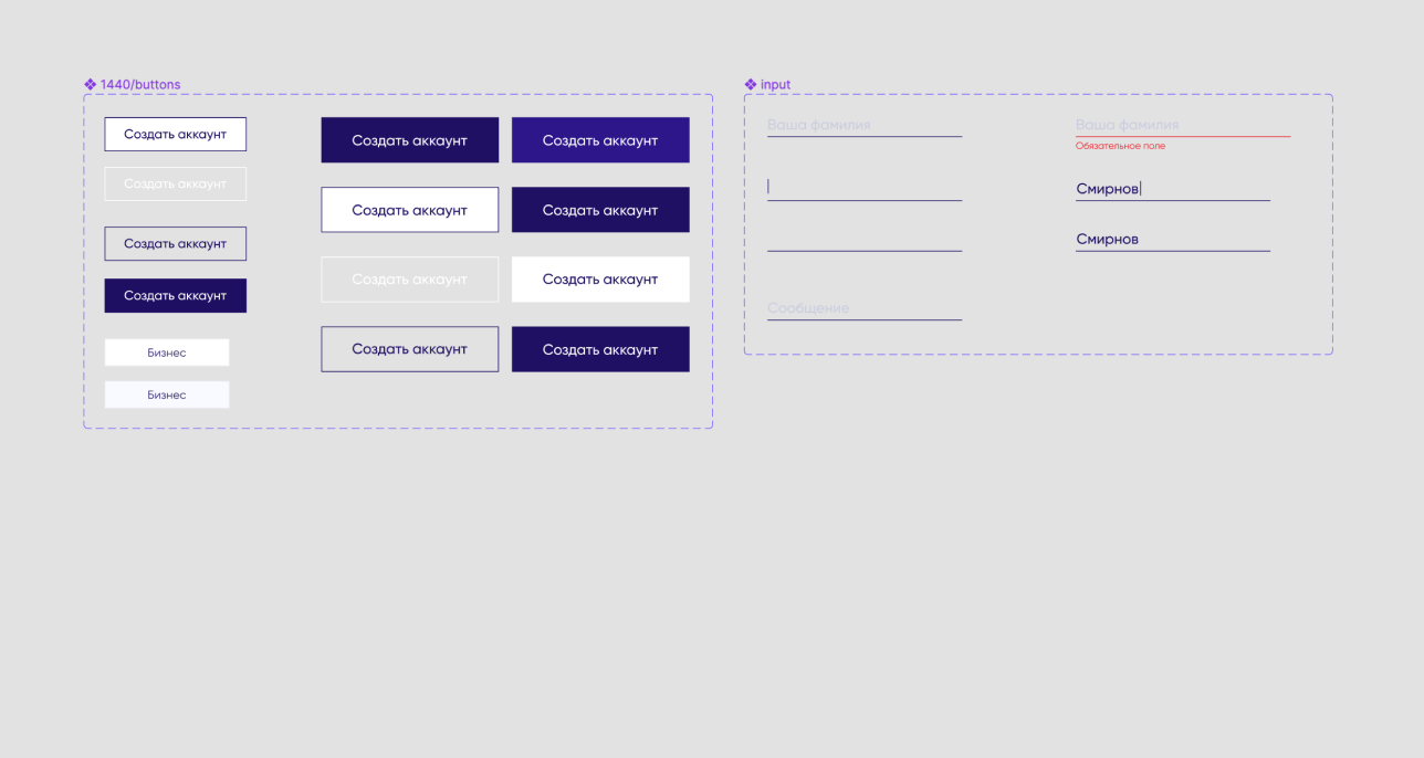
Atoms
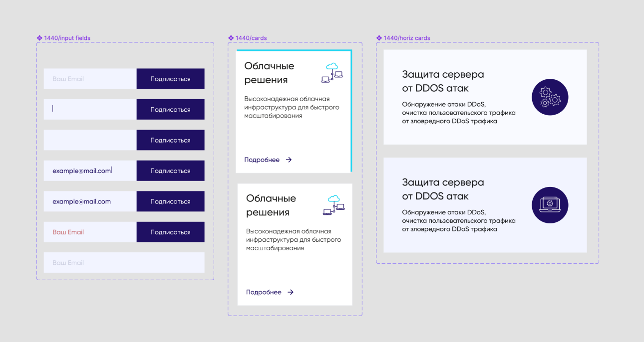
Molecules
Organisms
Pages
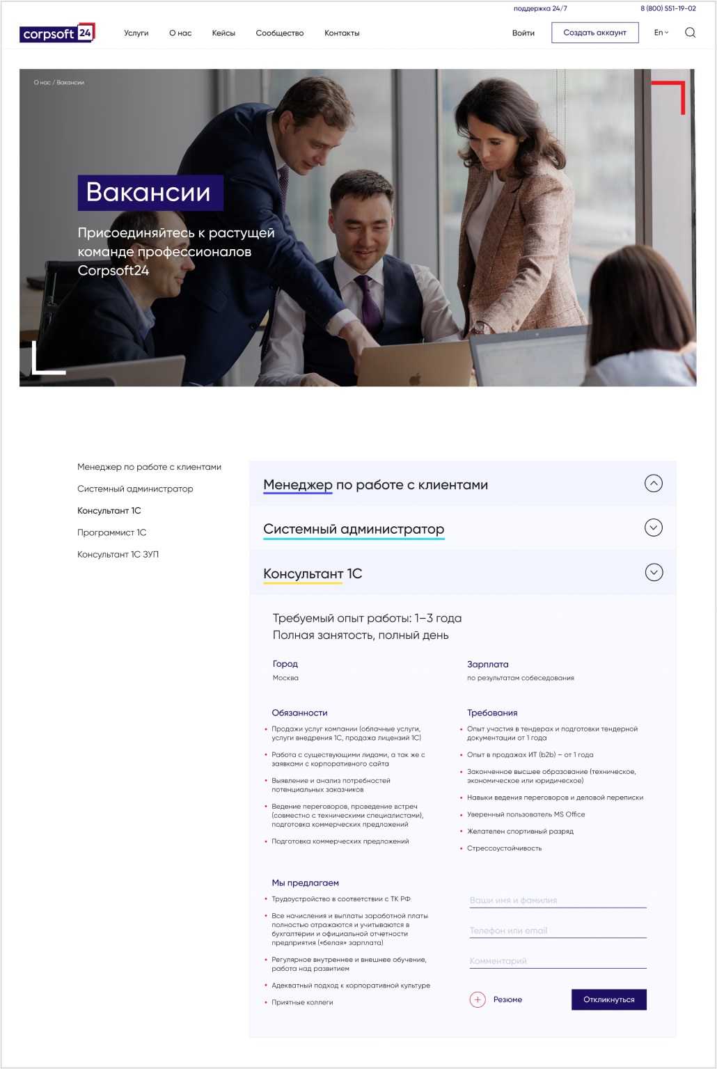
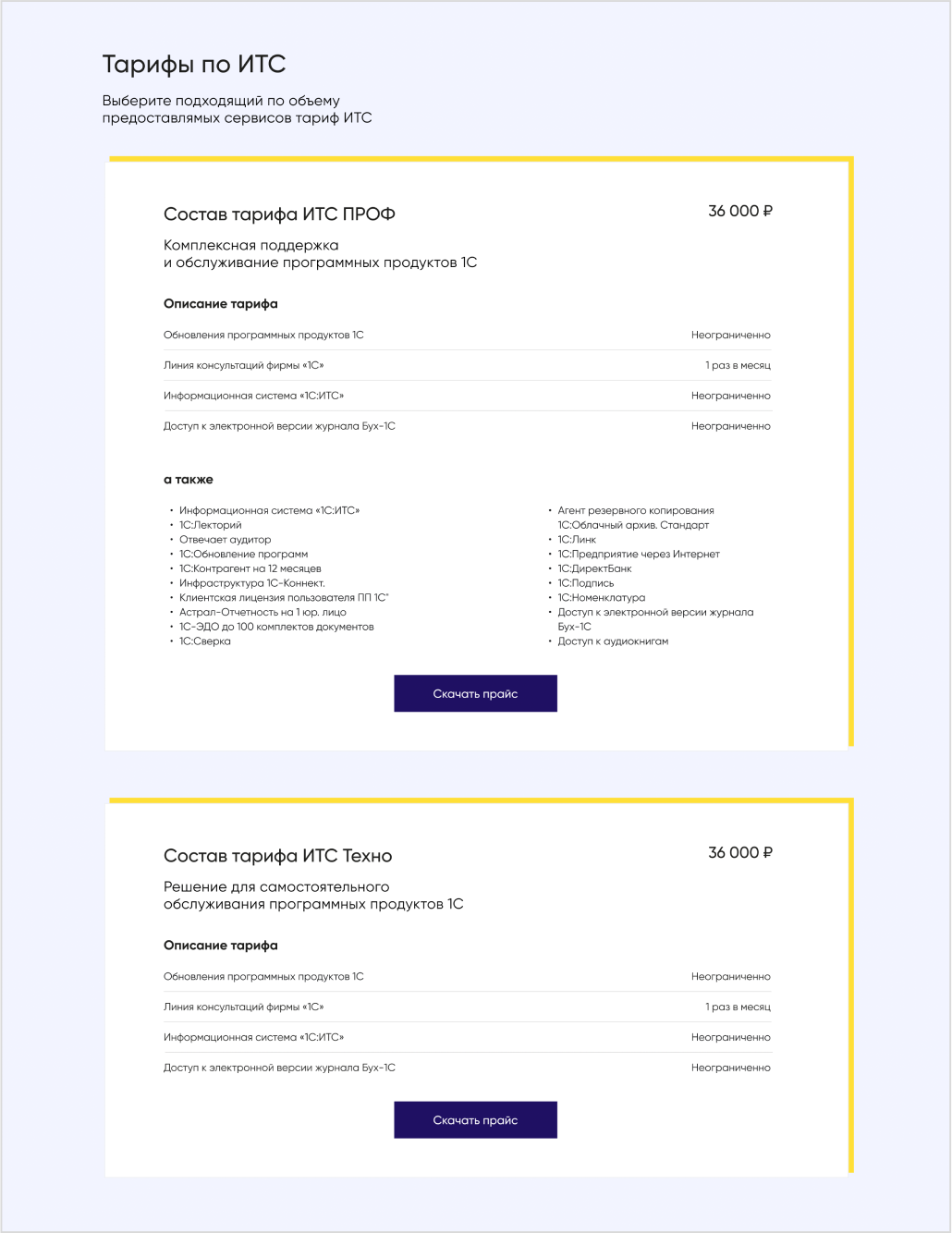
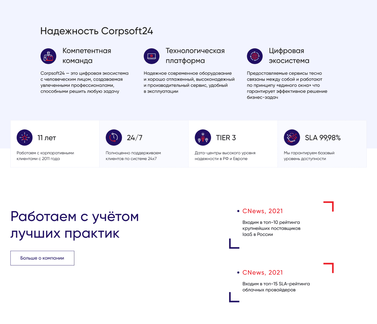
I made the inside pages look consistent
The pages consist of typical building blocks that can be reused to create new pages with minimal effort while communicating the main selling points and maintaining visual consistency. I set up an atomic design system that includes all the blocks
Created Tech Specs
for developers in Notion
for developers in Notion
I added all the references for animation in the video and text commentary format in Notion. Also, I wrote additional notes near each block in Figma so that the developers and I would understand each other exactly
Takeaways
Working on this project, I definitely ran into some challenges regarding the design system aspect. It was quite challenging to find the right way to build product pages from blocks. Every page has different information, but my challenge was to create a block structure that would work for every page.
In this project, I realized that it is important and interesting for me to find simple solutions to complex problems
In this project, I realized that it is important and interesting for me to find simple solutions to complex problems